
Airports are some of the most diverse and critical pieces of infrastructure in the rapidly expanding modern world. With the ability to connect cities 50 miles apart, or even countries separated by 5000 miles of ocean, they foster economic growth by providing business and vacation opportunities to some of the most unique destinations on the planet. As a pilot myself, airports are an escape from the urban bustle into the serenity of the skies, providing an opportunity to view the amazing progress of humanity from a very different and greatly unseen perspective.
HOK, one of the largest engineering and architectural firms in the country, was recently presented with the challenge of redesigning New York’s LaGuardia International Airport Terminal B in an effort to rethink ergonomics while improving efficiency and overall passenger experience. Join me, along with HOK Design Principal Peter Ruggiero, as we discuss current airport layouts, their inherent shortcomings, and how this information was used to redesign LaGuardia’s Terminal B into an airport of the future.
Peter’s career has been dedicated to reimagining all sorts of commercial spaces; However, he is well known for his role in projects regarding John F Kennedy International, Washington Dulles International, Newark Liberty International, and Chicago O’Hare International.
Types of Airports
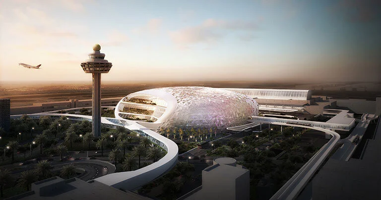
Changi Complex: Future Travel Experience
There are three main airport terminal configurations; Linear, finger, and satellite.
Linear Configuration
Linear terminals are the simplest of the three, consisting of a building that separates planes and cars. Passengers enter the airport from the car side while planes jet bridge dock or park on the other side. Linear airports are very common for regional applications where aviation traffic is not as heavy. The Mangalore International Airport in Karnataka, India is an excellent example of a linear design, take note of the separation provided by the terminal building;

Mangalore International Airport: Wikimedia
Finger Configuration
The finger concept expands on the linear configuration through the extension of “fingers” to accommodate a higher volume of planes. The main terminal building is referred to as the headhouse, and fingers were seen as a simple yet necessary solution to transform former linear designs to accommodate the rapid growth of the airline industry. The check - in area is on a wall when entering the building from the street side, and the security area usually bisects the headhouse horizontally.
This concept revolutionized flying and allowed airports to accommodate even more regional and short - haul international aircraft; However, the configuration was unable to accommodate the sheer size of long - haul airplanes such as the Boeing 747 and Airbus A380 following their introduction in the 1990s. The old LaGuardia terminal is an excellent example of this design, note the four fingers;

LaGuardia International Airport: Meredith Corp
Satellite Configuration
The satellite configuration promised to be the best of both worlds, providing a dedicated headhouse for check - in and security while allowing planes to jet bridge dock at “satellite” terminal locations. Architects have become quite creative when designing headhouse satellite connections, the most common are sky bridges, underground tunnels, or even automated light rail systems. Terminal 1 at Charles de Gaulle is a phenomenal example of a satellite configuration, where the satellites are connected to the headhouse through a system of tunnels;

Charles de Gaulle International Airport: AlterVista
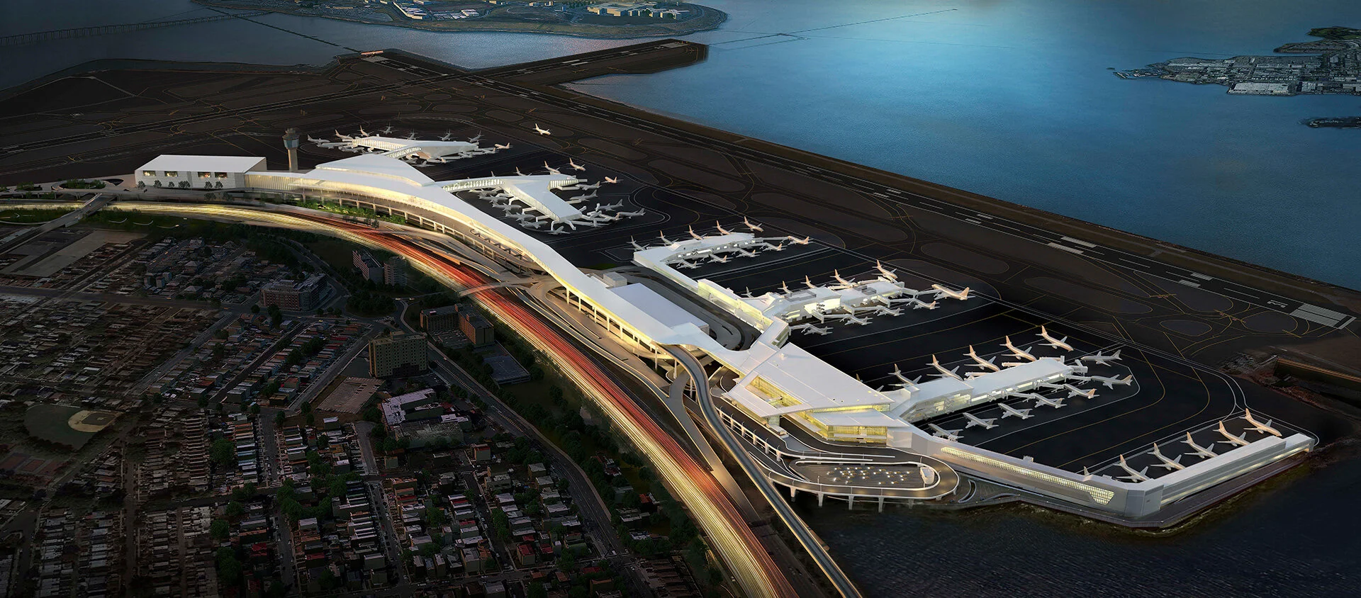
External Logistics and Improvements

LaGuardia International Airport Terminal B: HOK
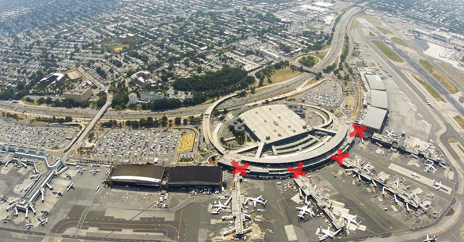
The main logistical problem with LaGuardia’s former Terminal B arose due to the archaic finger design. Panes were unable to park in headhouse connections, and were also inhibited from taking the shortest path towards the active runway, as they were forced to travel around the fingers. The red arrow represents the current taxi path, while the green arrow represents the optimal taxi path;

LaGuardia Taxi Inefficiency Diagram: Hugo Render
Through the use of a satellite sky bridge design, aircraft were not only granted the ability to congregate around all sectors of the terminal but also transit under said sky bridges to quickly and efficiently taxi to desired runways, greatly reducing congestion, and improving logistics, consult the diagram below;

LaGuardia Gate and Taxi Optimization: Hugo Render
Another glaring issue with the old infrastructure was the fingers creating an excessive amount of decision points. Decision points are self - explanatory, areas within the design which passengers must enter a point of no return, per se. With the headhouse - satellite configuration, decision points are reduced to a single point, so users can understand clearly when to proceed from the get - go, see diagrams below;
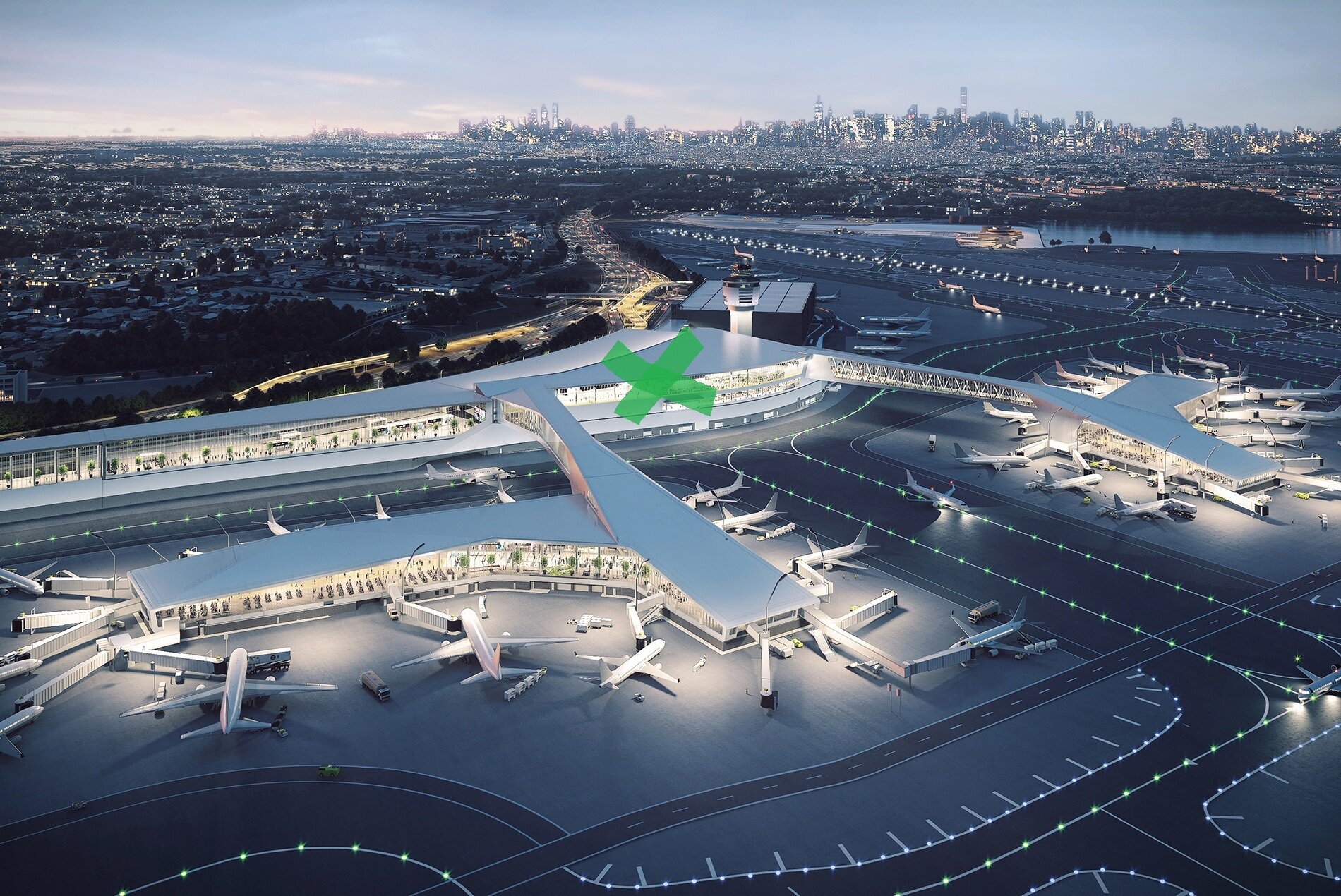
Terminal Logistics and Improvements
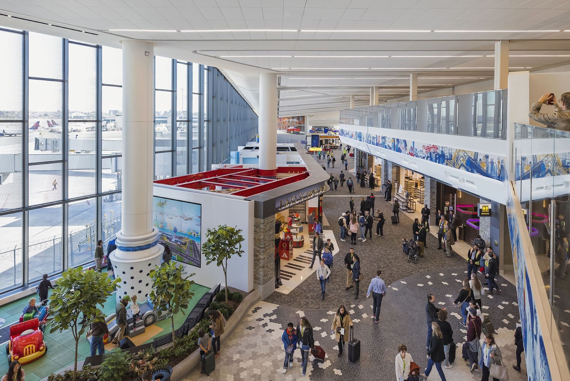
Peter’s mantra behind redesigning the terminal was based on solving frustration provoked by long lines and compressed spaces. The goal of the project was to construct a more flowing and open area meant to facilitate self - navigation through visual cues.
Check - In Area
Most check - in locations in today’s airports are long and walled, offering customers no perception of where they’re headed. This shortcoming also inhibits the flow of people who don’t require physically checking in, leading to a clustered and delayed experience. Island counters not only allow for a more open and progressive design, but also ease the overall strain usually associated with entering airports, I’ve included a diagram below for reference, the yellow boxes represent check - in islands;

Terminal B Check - In Area: Hugo Render
Security
Security in the previous terminal iteration was implemented at the base of finger - headhouse connections, which not only caused congestion but also put a great limitation on the amount of baggage scanning machines able to fit into the space. The new Terminal B security bisects the headhouse, facilitating a shift from 12 stalls to 22, making this single security location the sole design decision point.
The area also features a significantly higher ceiling for spatial illusion, and an expansive glass window facing the airfield. This not only opens up the space dramatically but also helps passengers get a much clearer idea of where they’re headed; Both concourses and most gates can be seen from this window. I’ve included a diagram below, outlining the security area in green;

Terminal B Security Selection: Hugo Render
Departure Area
In the previous Terminal, space was constricted to 60 feet in width and around 10 feet in height, as seen below, I feel the negatives here are self - explanatory, it literally looks depressing;

Former LaGuardia Terminal B: Aureus
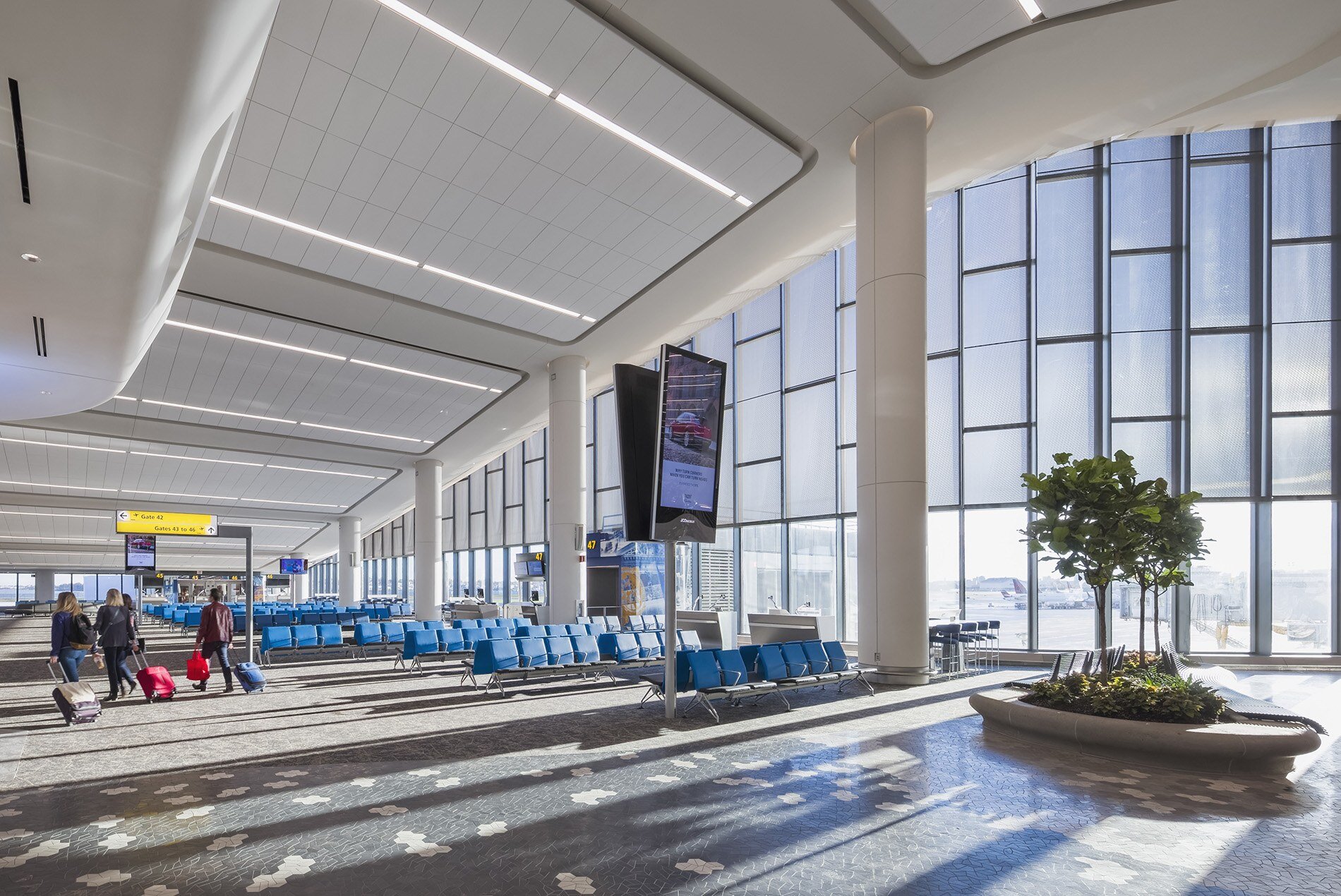
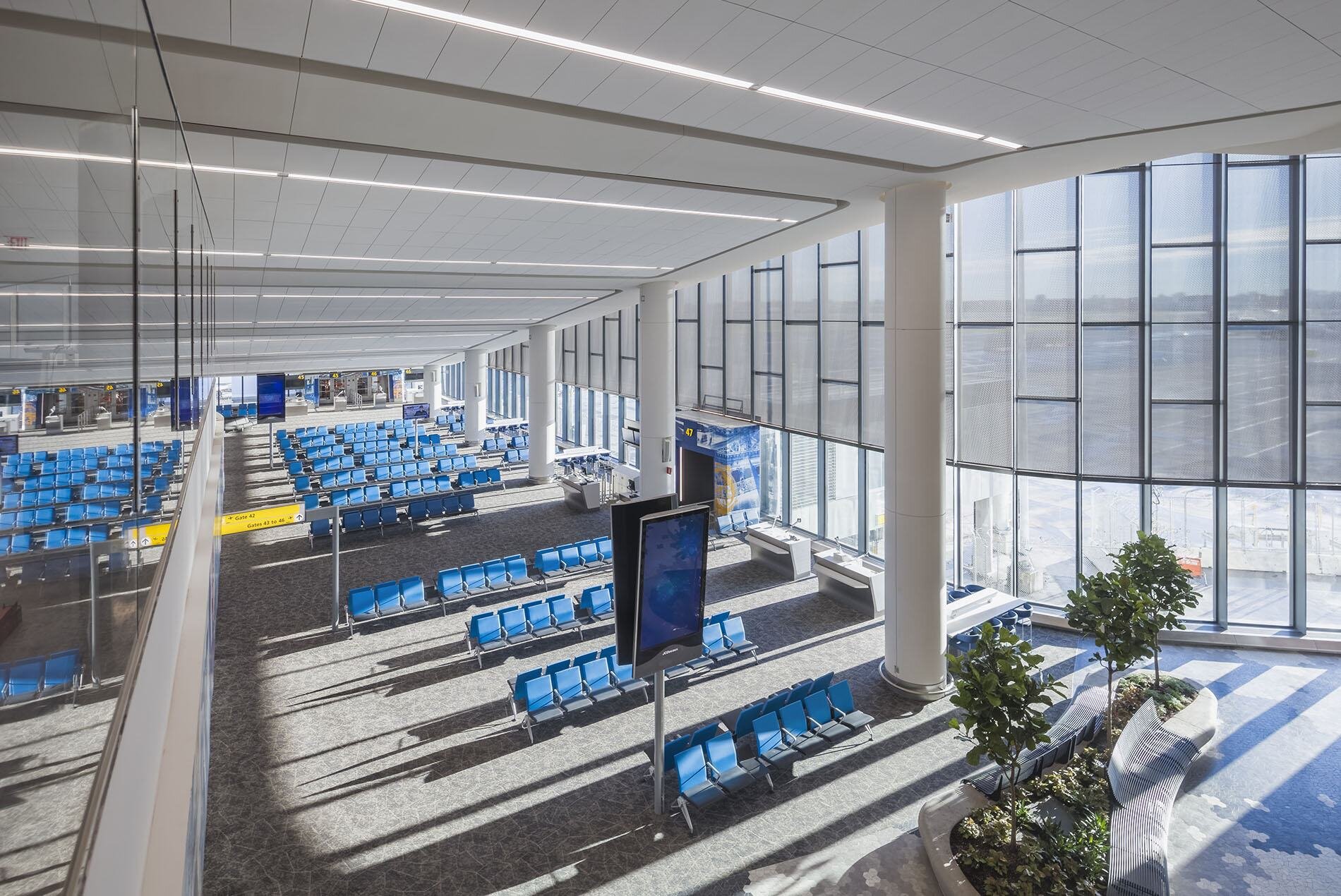
This space was enlarged to 120 feet in width, and around 60 to 80 feet in height, creating a much larger scale and promoting openness in the area; Passengers want to see as much as possible when transiting an airport. I encourage viewing the departure area renderings in the gallery below;
Baggage Claim
The baggage claim is normally one of the most congested areas in an airport. Most modern carousels are designed around these enormous pillars, which inhibit the usable space of the belt. The solution here is simple; Create an island style concept similar to the check - in area. Carousels would be placed near no pillars to allow maximum congregation around the belts, and 60 feet apart to provide passengers without bags a fast, direct, and easy egress of the terminal. Consult the Terminal B Check - In Area diagram for a visual interpretation of this concept.
Hugo Render’s Involvement in Commercial Sector Redesigns

Beijing Daxing International Airport: Wikimedia
What HOK was able to accomplish with the LaGuardia Terminal B redesign was absolutely incredible, and truly attests to their prowess as one of the top architecture firms in the world. I encourage checking out their publication here, and Peter Ruggiero’s in - depth design explanation below, the inspiration for this article.
Rethinking commercial architectural design will be imperative with time, especially when factoring in the world’s rapid population growth. Designs will need to primarily focus on efficiency while promoting ergonomical spaces. Hugo Render is more than ready to breathe life into any illustrious concepts that may arise, no matter the scale and complexity of the project.
Our panoramic images and virtual reality capabilities will showcase said designs in a medium promoting excitement and elation, ensuring conception and reality align before any ground is broken. Terminal B’s redesign is an absolute feat of architecture and engineering, and we can’t wait to see which sector is next in line.